
 Campaign Microsite Design
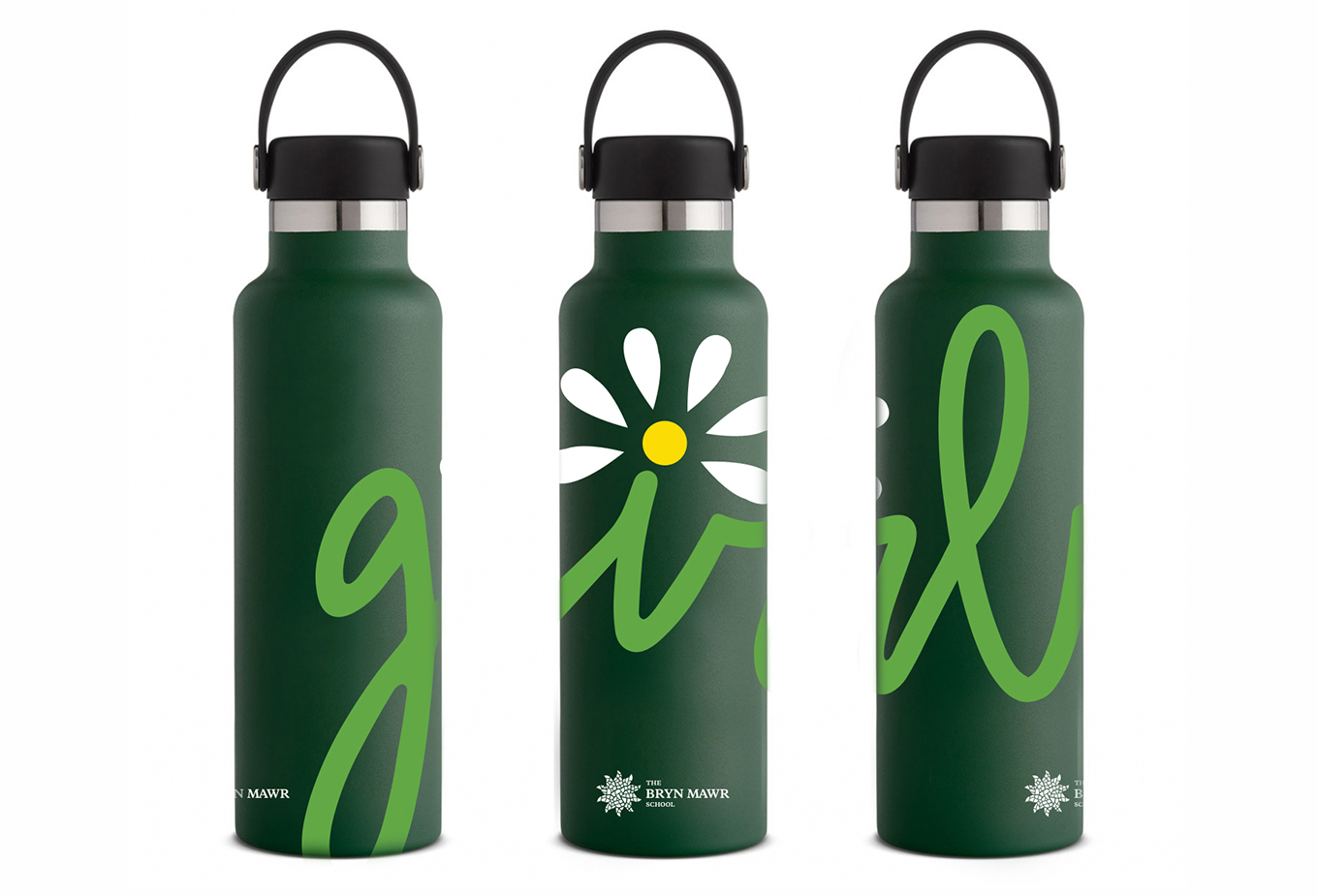
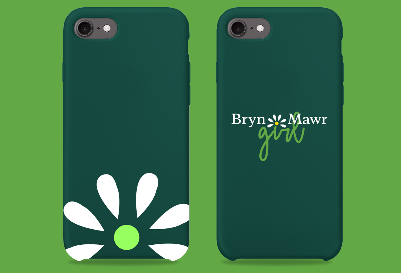
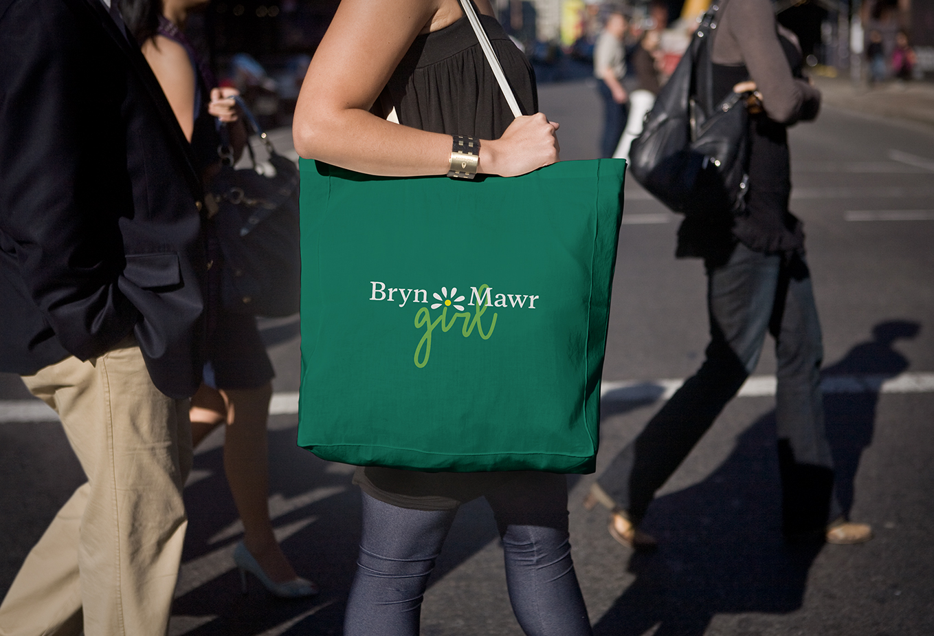
The lettering style in the word ‘girl’ has a playful, friendly vibe. The hand-drawn style helps emphasize the handmade and personal values of the campaign. The daisy as part of the mark, combined with the Bryn Mawr typeface, makes the brand recognizable and memorable.
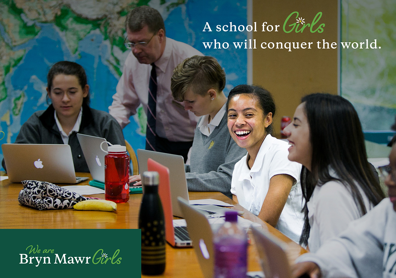
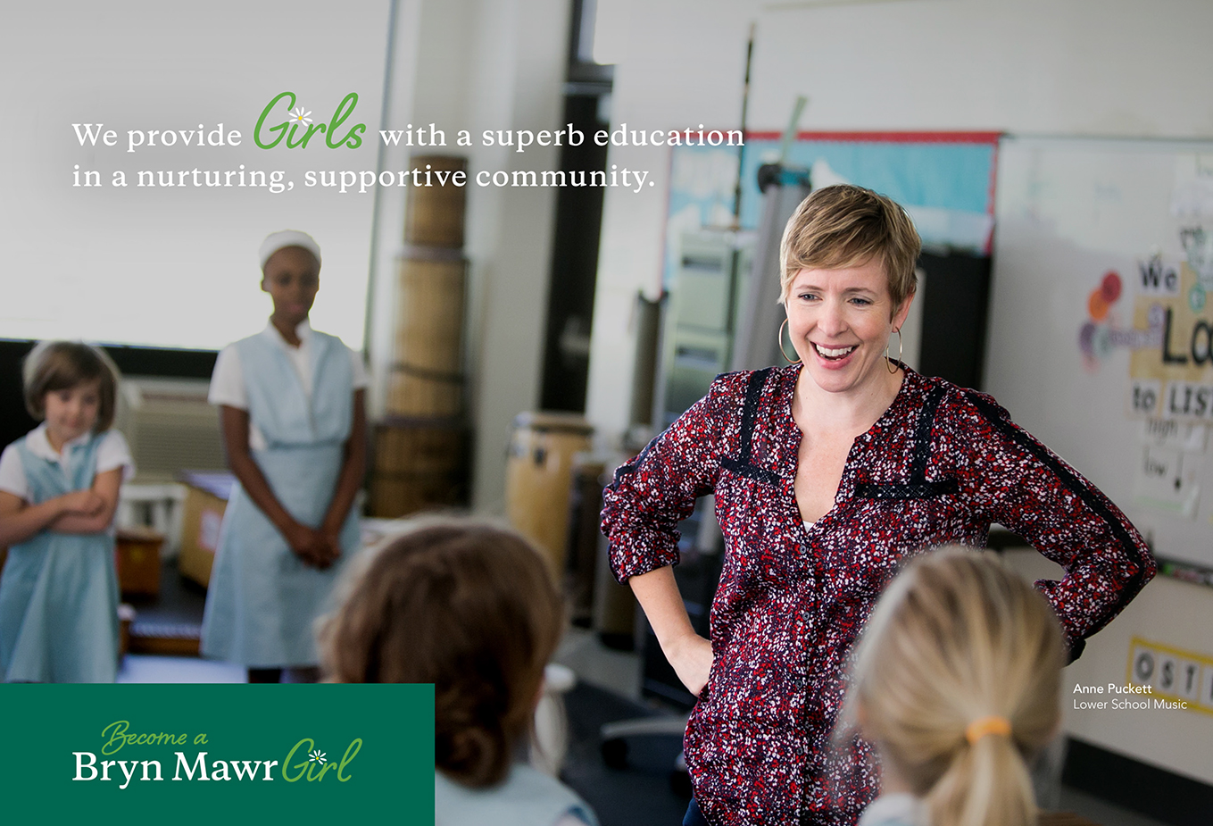
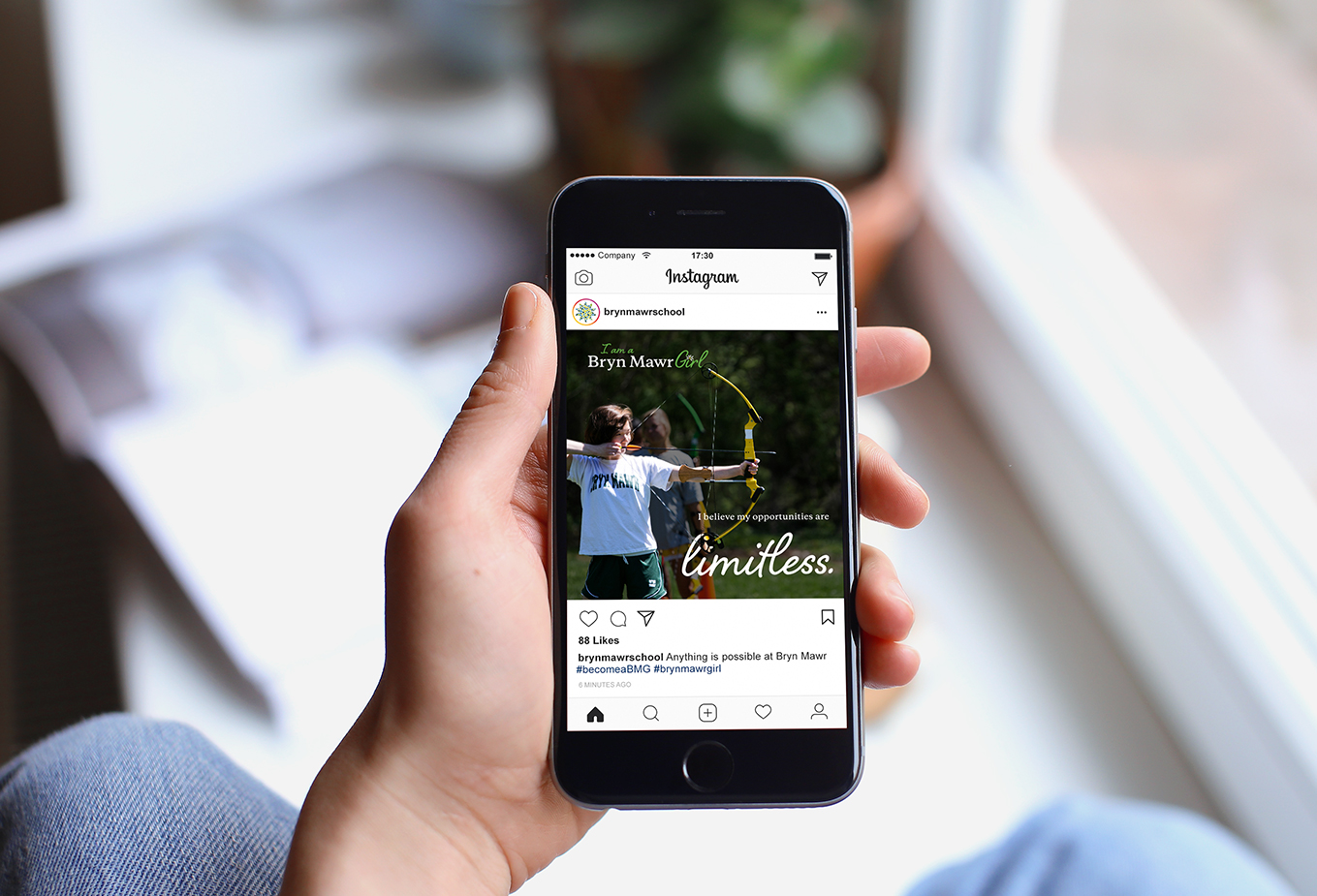
A huge part of the Bryn Mawr Girl Campaign’s objective is use of the descriptive words. Every piece of creative is meant to show the audience how the girls are feeling or thinking. These powerful words represent why the girls love to be Bryn Mawr Girls and why a prospective student would become one. This helps the campaign to resonate with the current students or alumni, while promoting the school to new audiences.
View Styleguide
Please allow me to introduce myself. I am a passionate designer currently residing in Baltimore, Maryland. My main area of focus is thinking and actualizing on digital experiences; everything from web, mobile devices, UI/UX, and video direction. Although I’ve been in an interactive role for the past few years I come from a print design background and still love to work in the print/ branding realm. I am currently lead designer at a small agency in Baltimore, working on a wide variety of projects.
I graduated with a BFA in Graphic Design and I’ve developed a diverse professional background since then. I am always aiming to produce pixel perfect visual solutions and the best possible outcome for the user.
If you want to see more of my work or even just say hello, please don’t hesitate to get in touch!